Evo Punks
A downloadable game for Windows and Linux
The Team
- Project Lead and Programming by Maximilian Schecklmann
- Artwork and Visual Lead by Kai Schütz and Justin Nightink
- Sound and Music by Dilara Köseoglu and Alex Keinprecht
The Lore
The earth and society as we know it has ended. A global event has molten the deeper levels of the earth's crust. As most parts of earth have been flooded and the majority of life has been vanquished the last human survivors strife to survive. A new world has formed with new terrain, biomes, heights and cultures. What will happen if there is no society to be lead by? Will it be a brutal mad max episode, a cyberpunk massacre or a solarpunk utopia? Choose yourself and defend your new kingdom.
The Gameplay
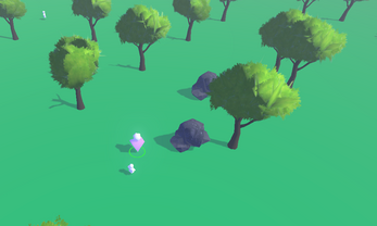
We strife to make it as accessible as possible to play our game. There are only the inputs listed below. Due to time pressure we were not able to perfect it, nor add the final elements like enemy AI. An upcomming update will bring a ton of new features and content. Be patient!
Inputs:
Move with WASD, Arrow Keys or Controller
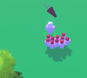
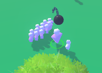
On Controller you can press basically any button but on keyboard there are only two inputs. The space key for friendly input and the shift key for hostile input.
Good luck adventurer!
https://ldjam.com/events/ludum-dare/55/evopunks
| Status | Prototype |
| Platforms | Windows, Linux |
| Authors | Narrenschlag, Voidboard, NEFERA, AREKUZA |
| Genre | Strategy |
| Tags | 3D, Cyberpunk, Ludum Dare 55, rts, solarpunk, Tactical |
| Links | Ludum Dare |


Comments
Log in with itch.io to leave a comment.
Nice mechanics and idea, but it’s lacking an onboarding experience. I needed one run to figure out, what can and should be done. In general only having an icon is ambigious. An text overlay, what a key press does or why something is currently not possible (building a base, converting someone), would help a lot.
Nice feedback thanks, any ideas on how we could solve that withou text? Maybe a red effect on the resources or something when pressing the build button?
A common way would be to show what is required and highlight the still missing parts in red. That could mean that you show the base icon with the necessary resources (x trees, y stones) and color the missing resource in red. Or in case of the converting, a red base could be shown. Although this would not solve all problems.
At some point of time the game must communicate, what is the goal of the game. For a jam game the simplest solution is a wall of text.
gonna remember that for the next jam! Thanks Grau!